Thursday, 27 May 2010

Final Pieces


Hey all

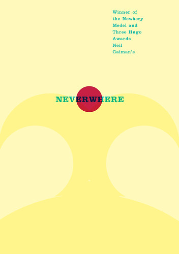
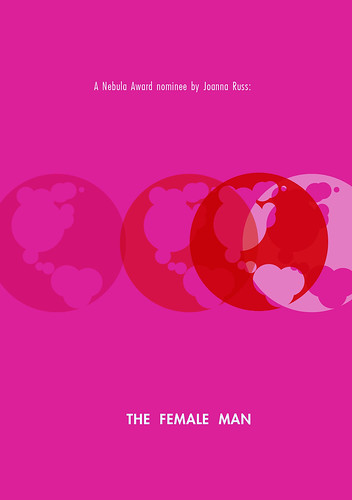
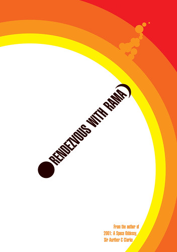
After many long weeks and long hours the final pieces are finally in and submitted for marking. Click on the images below to see how they turned out.


Thanks for following and stay lucky :)

Leigh

Friday, 21 May 2010

London below below below below

Still not happy with Neverwhere. What do you guys think? (click to enlarge)

Thursday, 20 May 2010

So far so...


Click to Embiggen.

Outside/overlay covers:

Inner covers:
The Female Man awaits completion and I may redo Neverwhere and Earthsea in line with earlier ideas, and tweak Rama.
Opinions please...

Friday, 14 May 2010

Another Neverwhere sketch


Just a sketch to test out the grid system. It seems to work pretty well. This image is a bit cluttered, but at least I spelt 'Medal' right this time.

ETA, colours were a bit too busy on the last one so I dialed them back and got them working together a bit better

Wednesday, 12 May 2010

Grr!

The new cover to Frank Herbert's Dune (one of my preliminary choice ) does exactly what I set out to do with this project! Stop catching up with me, real world!
The whole thing is made up of stars, tessellated and used like halftone dotes, the title picked out in white stars, from Hodder Great Reads range

Pictures when I can find them. No wait here it is, image via Hodder books:


But at least this proves I was hitting it on the nail when I wrote the brief, all those weeks back.

Stay lucky, every one :)

Monday, 10 May 2010

Sad News

Death of famed fantasy book cover artist and illustrator Frank Frazetta

Another visit to Waterstones.

In the space of a month a lot more colour and variety as been injected into the Sci-Fi shelves. I do wish I was a bit more ahead of the zeit-geist, not just in step with it.

Saturday, 8 May 2010

More Sketches


Based on the Obstruction: Use only circles, showing my two backup fantasy choices. Overprint on the Mort image produces a very thin blue edge on the scythe.

Thursday, 6 May 2010

Books as objects

Reading essays by (among others) the beautiful and gorgeous maker of beautiful and gorgeous books, Audrey Niffenegger. I am a pulled back to thinking about books as objects. How they are physical portals between the private worlds of our own heads to the broader worlds of our total cultural experience. That, as artifacts, they should carry potency and be treated with respect. That those considerations should be bound up in their making, even by deliberate irreverent omission. But I'm back to the question of how to create those- do I use a board bound format. can it be done in paperback. I think those questions need to be answered by what can be printed in the time that I have- what is available to me. There is no point considering the physical object if I'm not going to produce a physical object.

Saturday, 1 May 2010

Less disheartened

The thing is every idea has been done before. And if you find out that one of yours has already been done, then you can take that as a call to find something else or you can keep your old idea and be the one who takes it to the next level, or adds the next twist to it.

I was principally downed by the fact that a book design here http://www.abduzeedo.com/amazing-illustrations-micah-lidberg Under Firestorm (1/4 the way down) was exactly the same as an idea I'd been scribbling and toying with. And for Orion and Fallon, no less. Big name companies. But, you know, I got to my idea on my own and my idea was more about using the temporal aspect of opening the cover to reveal more of the story, not just to find an interesting (and extremely successful) way to covey texture an image.

Also: Electroluminescent covers. Beat that.

Disheartened

By the fact that every idea I have seems to have already been done.

Tuesday, 27 April 2010

Two Treasure Troves

Worth Sharing:
http://www.baen.com/author_catalog.asp?author=RAHeinlein Click around the Baen site for some howlers of noisey, undirected composition, overblown and gaudy type treatments, classic muscle men and chainmail bikinis and the occasional surprising gem of kitsch.

http://spacesick.blogspot.com/2009/01/i-can-read-movies-series.html There are a few of these going around, especially at the very NSFW 'Something Awful' photoshopphriday section, but spacesick (untrained in Graphic design, a testament to his natural talent)is among the best. His covers have even been featured in Creative Review (Mar 2009). What is so excellent about them is how he (instinctively?) boils something essential about the movies into a simple two tone illustration.

Friday, 23 April 2010

Book List As It Stands

The votes are in and lots of factors have been considered, over quite a long period of time. Although subject to change, the layout is:

Core Choices
William Gibson Burning Chrome
Robert A Heinlein Time Enough for Love
Ursula Le Guin Wizard of Earthsea
Margaret L'Engle A Wrinkle In Time

Backup Choice
Arthur C Clarke Rendezvous with Rama
Richard Matheson Incredible Shrinking Man
Joanna Russ The Female Man
Anne McCaffrey Dragonflight

Thanks to everyone so far, your input has been enlightening and invaluable.

Blimey

Gollanzc isn't doing to bad with some of their titles- have a look at the paper based images here http://bookcoverarchive.com/publisher/gollancz_orion_pub_group

Well I'm going to do better.

More books I like

I remembered I was actually quite fond of Emma Wallace's fairly minimalist work on Steph Swainston's "New Weird" fantasy books But all her work is pretty Inspiring. Check it out: http://bookcoverarchive.com/emma_wallace

Image via Amazon:


Also how much can be picked up from ages past: http://www.lib.rochester.edu/index.cfm?page=3348 esp Lark of the planets.

Wednesday, 21 April 2010

Just a sketch

Put type aside and just threw some letters in for placeholding. The totally familiar, a set.

Other Cover Worth a Mention

The Hitch Hiker's Guide To The Galaxy is one of my All time favourite covers. I grew up with this edition and will defend it to the death (Image via Wikimedia).


It was re-released as the cover design in 2005, to coincide with the film, sduch was the nation's affection for it's garish video colours- with the idiotic omission of "Don't Panic" in big, friendly letters from the back.

Well lets look back at the task I've got. This is basically a relaunch. What have we had in the past that were striking and effective relaunches of one sort or another.

Penguin Great Ideas: Four Series of these slim, white books with typographic letter pressed covers. They are gorgeous. It is to my greatest chargrin that I only own a couple of them, cruelly faded by sunlight. They are simply lovely to hold. Jim Stoddart and his team have won enough awards for this range and need no further praise from me.

2008 Bond Relaunch
, again by Penguin. Now what these do is entirely embrace audience expectations of the books and turns is back up them, volume set to 11. The texture and form of them is entirely pulp-y and sex-ploitation-y, but this become fitting an apt when seen as a set, fun and energetic. This is one of the outcomes of post-modernism, the embracing by not-so-much re-appropriation (how is it being re-appropriated, instead of just being used for the same-as-original purpose?) but reclamation and re-use. Whereas modernism would try to rationalise the end result of this process, in a post modern era we can amplify out emotional response. Sex and typography, as Robert Brownjohn might have it. (Images Via http://bullyscomics.blogspot.com/ and Kitsunenoir.com)


Bully's comics also provides an excellent view of Bond covers through the ages.

In 2006 penguin re-released some of their classics with covers commissioned from artists from the world of graphic novels, comics and cartooning. While seems seems to be faddish- following the success and media attention around films based on comics and graphic novels such as Sin City, the results were still quite interesting. Here are some via Amazon


Yes we are back to illustration- but where it's not expected, where it is interesting, sometimes critical, and original. None of them really change the 'look' of the book or shatter preconceptions- to the credit of the artists aptness is never in question. Which brings us to the problem that is a sticking point for me. People want what they expect. They also need to be surprised and shown things in a new way. Informal interviews have told me that both fans and non-fans of fantasy books have a stereotype in their heads of the sort of covers I blogged links to earlier on, spaceship and metal bikinis and musclemen, painted to varying qualities. But fans actually expected Fantasy/SF books to look much as they do now, with a heavy emphasis on how well they look as a set, and how identifiable they are. What the bond books achieved was new-old look, and they managed it by seeking out an approach that defied and yet was sympathetic to the expectations of the audience. Sympathy requires empathy and, usually, a measure of affection. Letter pressed 50s rocket ship in deep purple under an entirely typed layout? I need to get sketching.

These were blogged elsewhere- More on Harry Potter.

I wasn't very taken with them, but when they turned up on Grafik magazine I thought about them again. Now they are fairly obviously anachronistic- 7's pseudo cut vinyl print effects rendered in contemporary colours and a bit of (maybe naff?) glamour at the top.


But, you see, that's what Harry Potter has to be now. It's no longer an event. It's a brand and brands exist in memory (especially emotional memory). The next Harry Potter book can't look like the last in the line because there will not be another next-in-the-line. Even the movies are nearly done with. So Harry Potter can't be a thing of the moment- it has to be dislocated from the moment. That way it can stay on the shelves long after it has stopped being fashionable.

So what have I been doing today? Mostly reading, Derek Birdsall, John Hohculli and 'Really Great Packaging Explained'- which is full of very sound (sounding) real world design advice. I have been thinking about the Grid, especially after Germano Facetti and Dave Pelham's work on Penguin. I've always used something like Birdsall's Modular grid, but my base units have usually been derived from one or two key x heights (which might account for my being stingy with lead). What if we tried artwork or photography, but broke Birdsall's rule of respecting it and cropped it to the point of abstractions, found some detail that bridges two worlds. Chest is full of the interstitial shapes and objects...

Reading is a bad habit, and most of the books are about internal typography, which is a separate issue- insights on format and jackets are what I need. I also need to stop reading. It's keeping me from taking the plunge into my sketch pad.

Tuesday, 20 April 2010

Obstructions are opportunities.

While talking to the ever inspirational (not to mention charming, intelligent and head-turning) Phatamgoricist I hit on the notion of limitations, probably with this film running in the back of my head: The Five Obstructions

I was talking about how just illustrating is a really obvious, and essentially uncreative, response to the challenge of represent a book visually.
So what happens to you idea gen, to your results, to your approach if you put on limitations

"Visually represent this book's content." results in illustrations
"Visually represent this book's content using only type."
"Visually represent this book's content using only colour."
"Visually represent this book's content using only geometric shapes."
"Visually represent this book's content using only one geometric shape and one colour."
"Visually represent this book's content using only one line of type and two colours."
"Visually represent this book's content using only one letterform, any face."
So the question becomes which line of type, which colour? How do I surprise and communicate to the viewer? What shape or typeface combinations have the right tone?

And it produces very thought provoking results, see this entry from (NSFW, as design collector often is) designcollector.net, particularly these approaches to TV shows:


So how far can you push it?
"Visually represent this book's content using only one print or weave of fabric."
"Visually represent this book's content using only a texture."
"Visually represent this book's content using only rubbing a texture."
"Typeset only one sentence of this book to make an effective cover."
"Create your book cover with only one application of Indian Ink."
"Derive you book cover design from one letterform from Helvetica Neue."
"Visually represent this book's content using only two circles."


Design by Germano Facetti 1975. Image thanks to coverbrowser.com


So what limitations should I apply?

Just an idea I wanted to get out of my head.

Hadn't realised how inspired by Nina Tara's stuff it was until I post the last entry:

Anyway, just so it is on paper and not bothering my mind (all images copyright Leigh Woosey 2010 unless otherwise stated). Found some beautiful Encaustic textures on creative commons and just had to use 'em:


Click to embiggen the images.