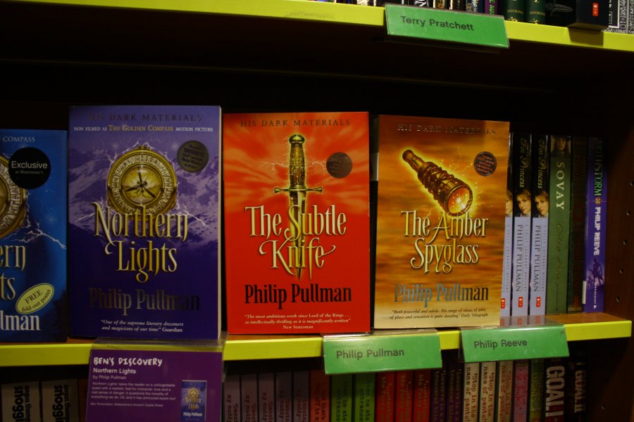
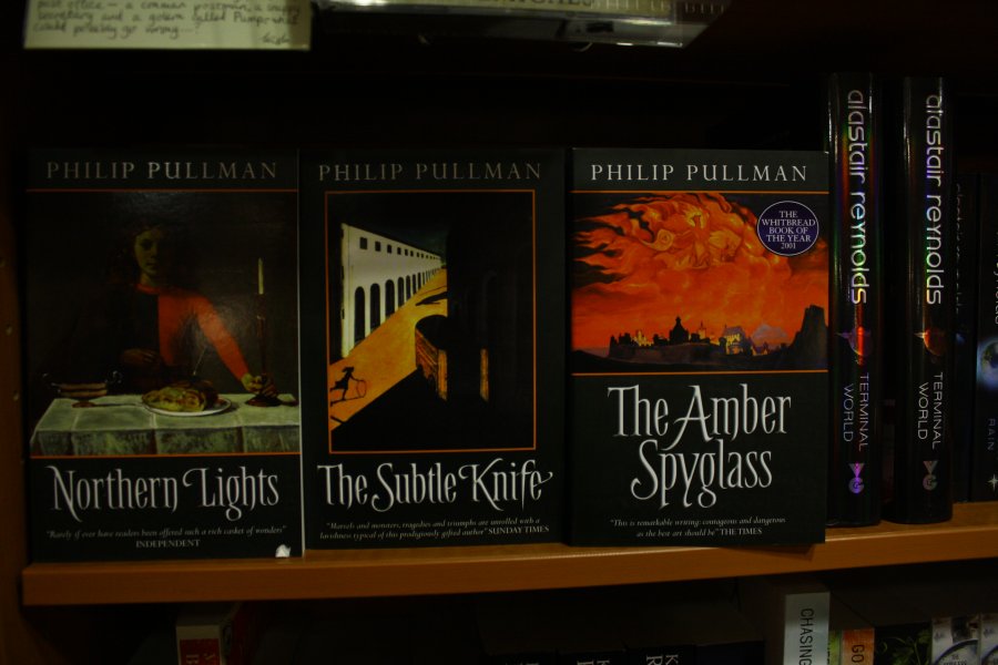
Lets start with the one that seemed to begin with the 'His dark Materials' Trilogy. First image thanks to Wikimedia Commons.

So where did this lead to? Although the trend is a little expired now, we can still find plenty of examples of it (apologies that some of the images are a little dark, photographer-in-a-hurry-in-softly-lit-bookshops fail I'm afraid).
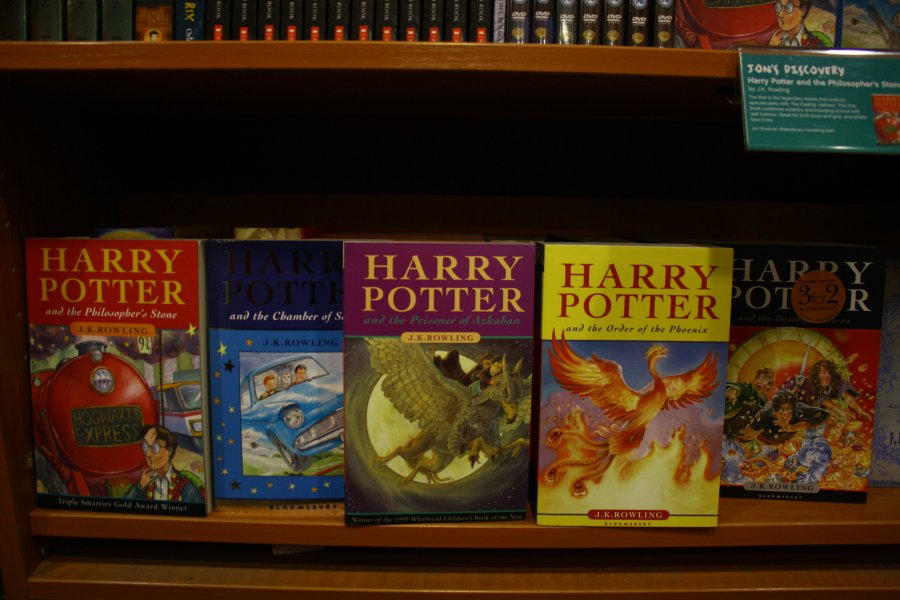
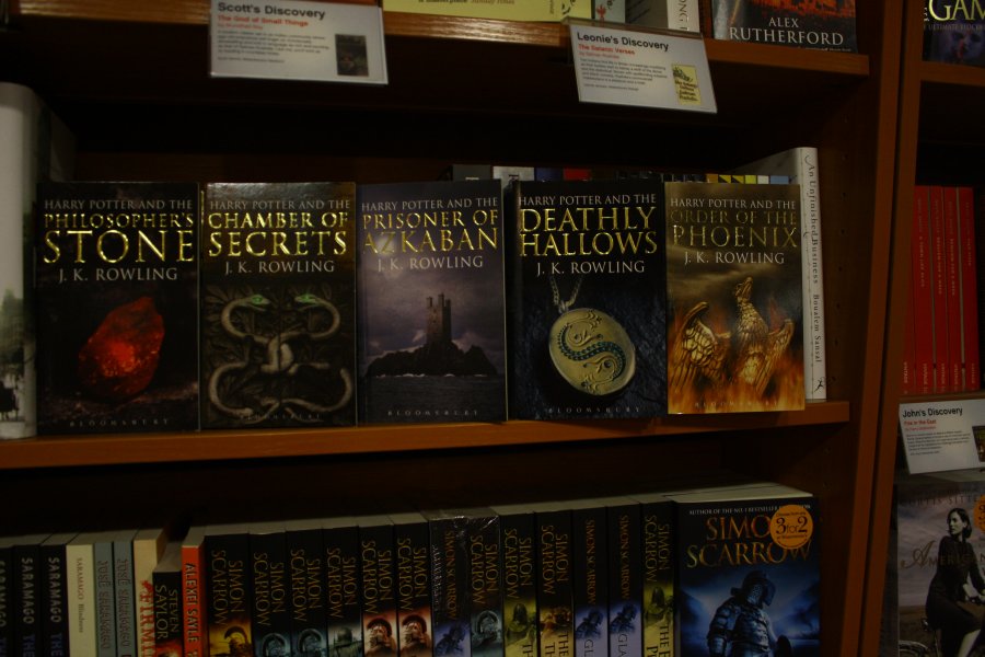
Now might be a good time to compare the Young vs Adult versions of the trilogy, and While we're at it the 'Harry Potter' series as well.
The type through consistent with both. They seem less ashamed to know each other than HP:
By now you should notice how these trends seem to be informing each other, it's a little more obvious in the later 'Discworld' editions:
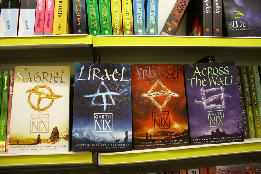
The black/object approaches seem to overlap or combine. Another key player seems to be the covers to the 'Abhorsen' Trilogy, which features a rare example of apt use of UV Gloss, where it creates an effect evoking the magical runes in the books, that can be seen by some and not others:
The books also use Kallos by Phil Grimshaw to great (and fairly) daring effect. I don't know if 'Lirael' was the starting point, but the monocromatic contre-jour landscape and figure are also popular:
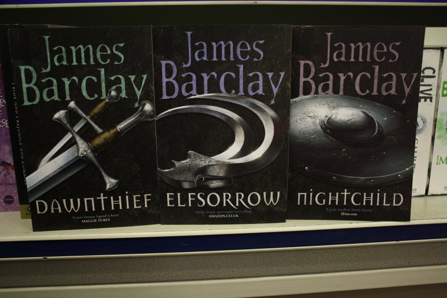
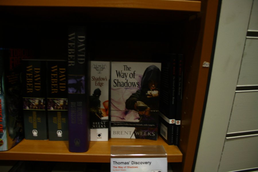
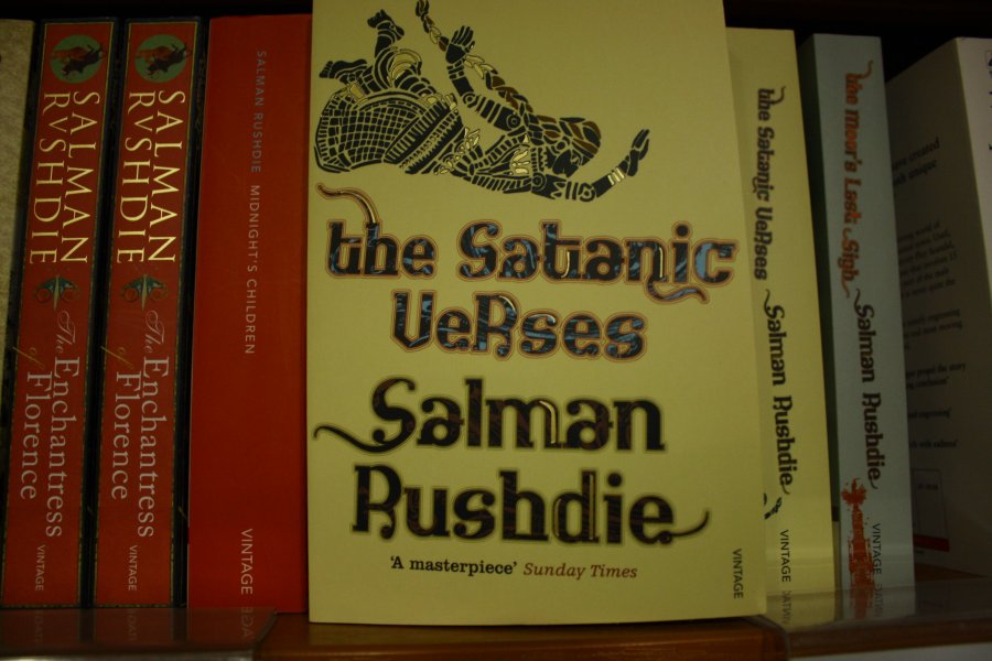
Figures alone- are preferred especially Hooded, armed and witha sweeping cloack. This one seems to be the type specimen:

Don't you hate iot when somebody turns up to the party in the same outfit as you?
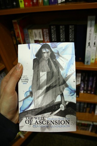
Although this one I quite like- it actually does something with the image and colour tints:
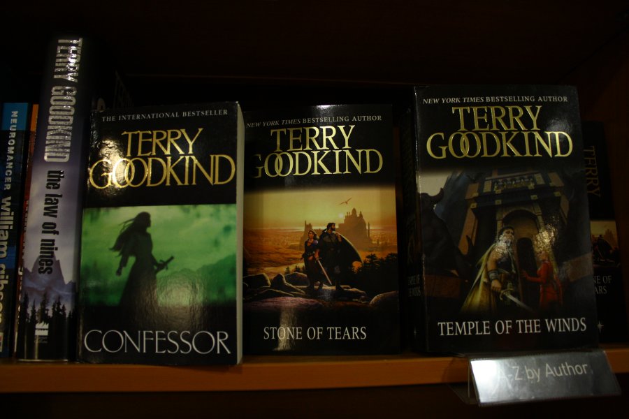
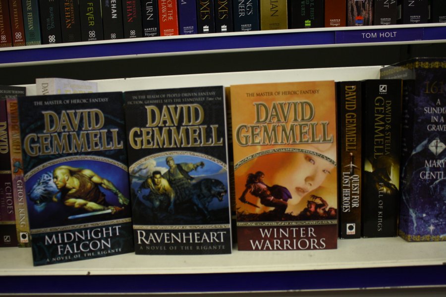
We should pause to consider that these books are part of their own series, which we might expect some internal consistency from. Readers buy one book after the other, expecting the next sequel to match the last on their shelves. Fantasy and SF fans also tend to collect by author (like the rest of us) so books by the same author will look as if they are part of a series, for the same reason. Here we see staple (but probably appropriate) fantasy images in a set layout for David Gemmel, who writes fairly definitive 'hack and slash' fantasy books:
But what interests me is the overlap of these trends across series and author. The art isn't bad per se- but it is predictable and raises the question of originality in the art direction- perhaps that is a concern that is eschewed in favour of equally predictable sales? I also question the imagination of illustration as an approach. The artists can't be faulted for the imagination or skill, but if the question is "represent the book's content visually" is the most creative answer really "draw a picture of it?"
The pictures themselves are so relied upon that Gollancz feel confident to solarize and 'gradient-map' their covers in trying to achieve a similar goal to my brief:
It's fairly striking, but not exactly revolutionary. Science fiction continues to rely on the classic imagery of spaceships and planets, although heightened by rigid and sharp typography and layout:
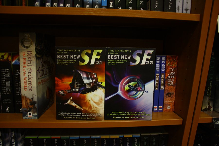

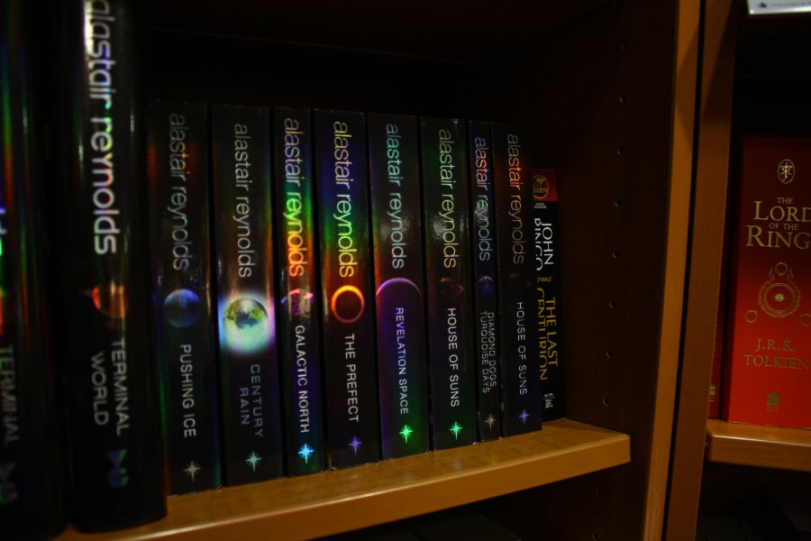
See also the 'The Culture' series, and Peter F Hamilton and Kevin J Anderson's books for really, more of the same- apt though. The Prismatic substrate here is a nice touch, but other than that, what really distinguishes it from the rest of the books in the section?
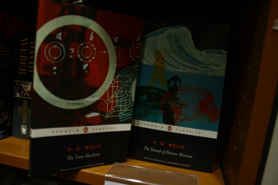
Perhaps more than fantasy the science fiction books seemed to be be different shade of the same colour, whereas I would like to see a Broader spectrum entirely. As I suspected, this only seems to occurs when a book is considered a classic or of some additional literary value, such as those by HG wells and JG Ballad:
Penguin's usual skill in art selection is evident:
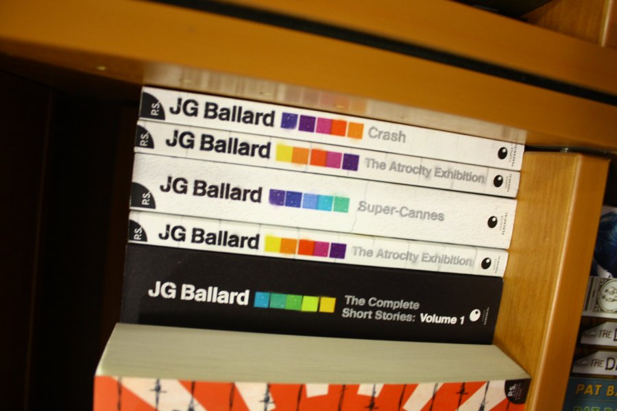
The Ballard books are much more interesting to me, an obvious effort to push the author:, stencil effects and dislocated squares of colour evoking the dystopic, alienated urban futures of his settings, bold and not directly illustrative, a step in the direction I want to go:
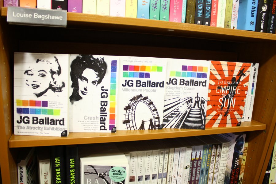
I was really quite impressed by the Ballard books, lets just look at how they stack as a set:
What else did I find?
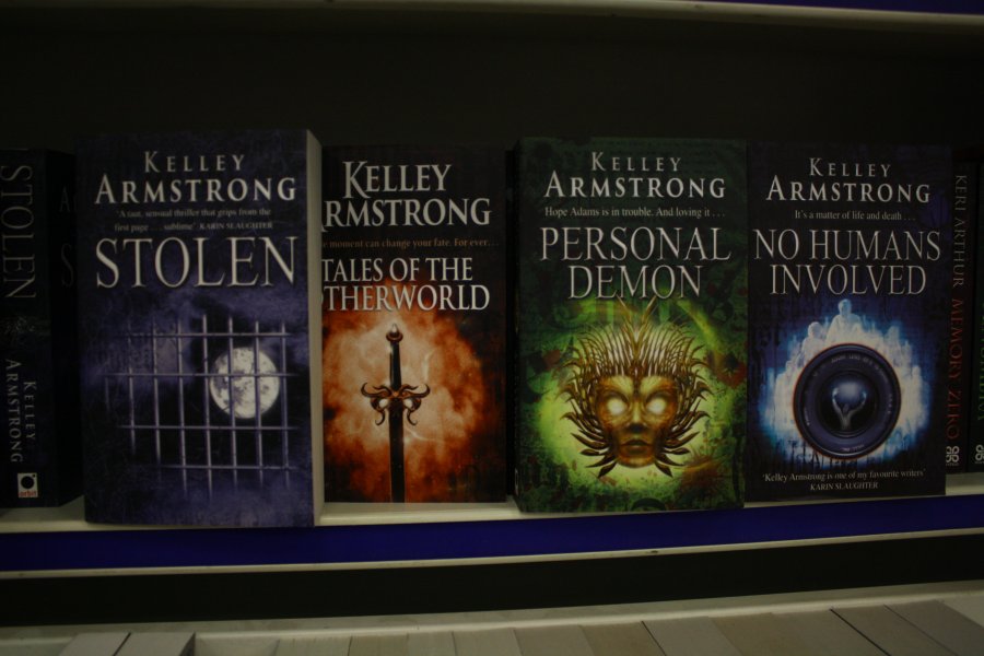
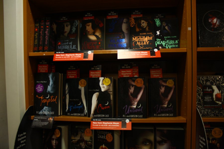
All Vampire /Dark Fantasy (according to Waterstone's) look the same as well. Yawn. And over use UV gloss for apparently arbitrary gothic textures. Double yawn.
Except the Anne Rice ones, thanks to the gorgeous (hand?) lettering of Kate Forrester:
http://kateforrester1.blogspot.com/2008/12/anne-rice-novels-typography.html
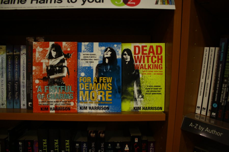
So did I find anything that really surprised me? Well... no. I knew what the hell I was talking about when I wrote the brief. I was pleased by the quality of what was produced, even if I was unsurprised by it's sameyness. And it really isn't limited to fantasy. Similar problems with crime fiction- Sans Serif coloured type over an enigmatic face/picture of a female back pushing the author and title. Family drama with tragedy books of the like by Jodi Picault have the a same soft/out-of-focus scene of tenuous domesticity and sensible faces (white, for preference) for author and title. 'The Girl Who kicked the Hornets Nest' seems to exemplify the former trend. Like all design, there is a tendancy toward efficent following of forms and trends. And this has the desired effect- to make something recognizable and desirable by the target audience. And Hats off to book cover designers who do that work. They have a lot to do and tight deadline and many factors to balance- art directors, editors, authors and retailers all have to be considered at one stage or another. Compared to that pressure to be conservative, Kim Harrisons series actually get extra kudos, even though I'd prevously found their layout a little leaden:
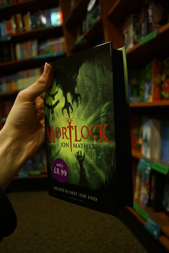
And there were a couple of books that I like for various reasons. Mortlock inks the edged of the pages black, making it a striking artifact on the shelf. If I had £8.99 and a month off to read in, I probably would have got it:
Most of the covers were uninspiring to me, only one or two exceptions:
The paperback editions of Stephen Fry's books with the animals should also be mentioned. Anything to do with Stephen Fry should be mentioned, and often.
Tomorrow I will put up some images of book and DVD designs that I do like, and make some way to deciding what I want to do.
Stay lucky, everyone :)
ETA: More of The Harry Potter Books http://www.greghinzmann.com/?m=200707. Early 'adult edition' top right. It seems so '90s' compared to what we have now. The past is another country.
No comments:
Post a Comment